Mood board – I get the general feel of the app from this, however, you are including content-based images that tell the viewer what the app is about, but you should be communicating what the ‘feel’ of the app is – its mood, not it’s content.
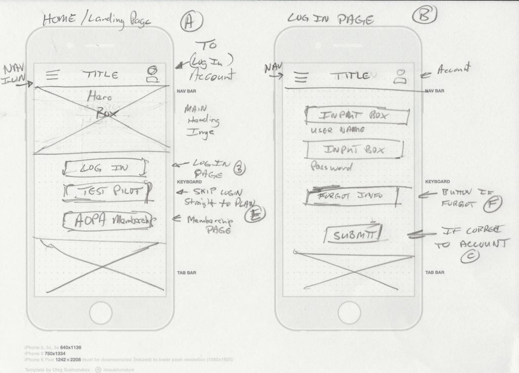
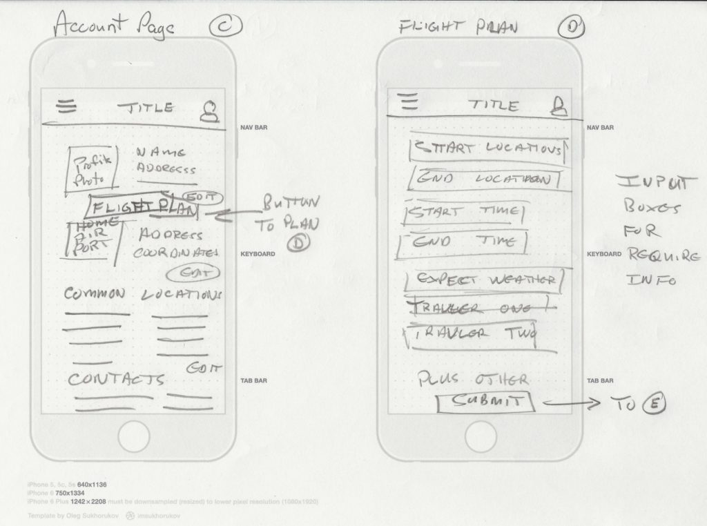
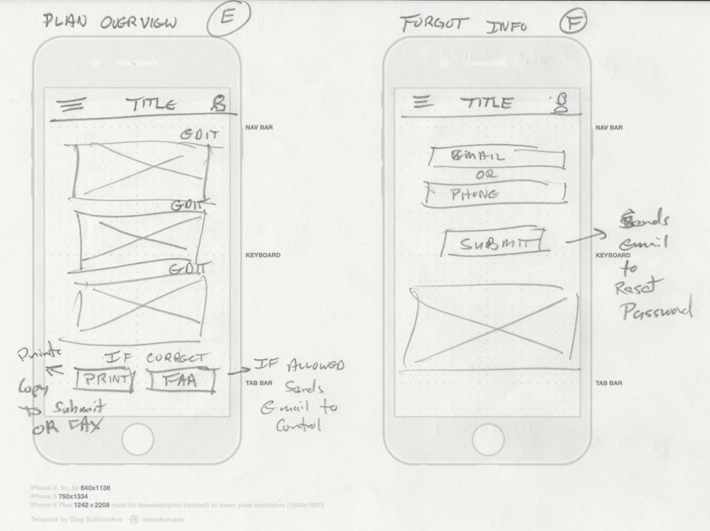
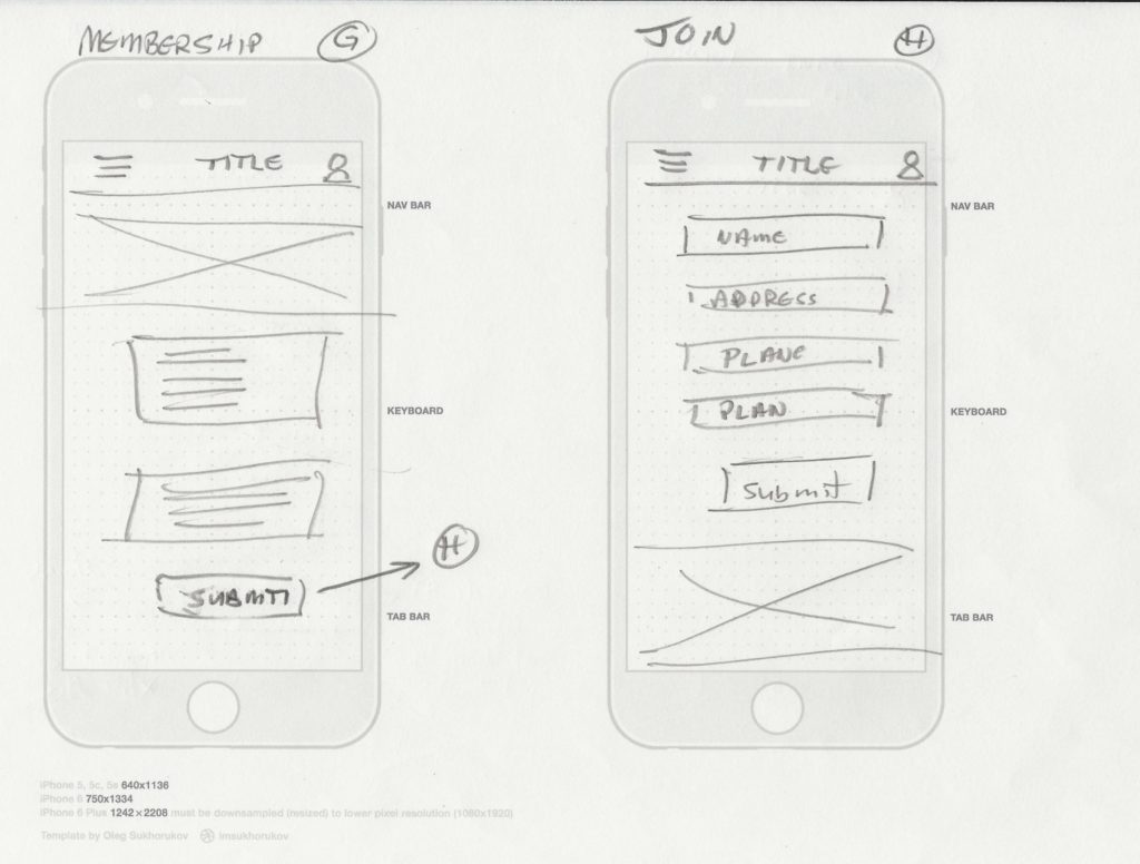
Wireframes – well done. I get what’s going on for each screen and the user flow is self-evident. That said, you were asked to use Add Media, which opens the image in a new page and enlarges it. As it is, I had to enlarge my browser window to see the details – which is not very user-friendly.
Mood Board – Thought I did, but I see your point. Couple images could have been different to get clearer “mood”.
Wireframes – I did “Add Media” and this is how it came out. I wasn’t able to view as you requested. What did I miss? I even clicked check box to open in new browser window.
mwilson
Mood board – I get the general feel of the app from this, however, you are including content-based images that tell the viewer what the app is about, but you should be communicating what the ‘feel’ of the app is – its mood, not it’s content.
Wireframes – well done. I get what’s going on for each screen and the user flow is self-evident. That said, you were asked to use Add Media, which opens the image in a new page and enlarges it. As it is, I had to enlarge my browser window to see the details – which is not very user-friendly.
Misko
Mood Board – Thought I did, but I see your point. Couple images could have been different to get clearer “mood”.
Wireframes – I did “Add Media” and this is how it came out. I wasn’t able to view as you requested. What did I miss? I even clicked check box to open in new browser window.